September 30, 2020
TEC 2020 Reboot
We’re helping many of our clients to come back stronger and better than ever.
Keeping a brand fresh and engaging requires ongoing care and attention. When we started working with The Energy Consortium (TEC) in 2018 (see our portfolio) we took them under our creative wing and recreated all their collateral to represent the business in a professional, cohesive way.
We laid-down a flexible hexagon pattern to hold imagery and colour which has worked very well across print and digital.
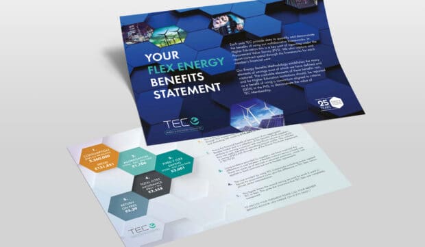
For TEC 2020, we wanted a reboot on this great look, so the brand is taking a 3D direction. Our 2020 look is dynamic with depth – almost as if you could jump onto the hexagons.
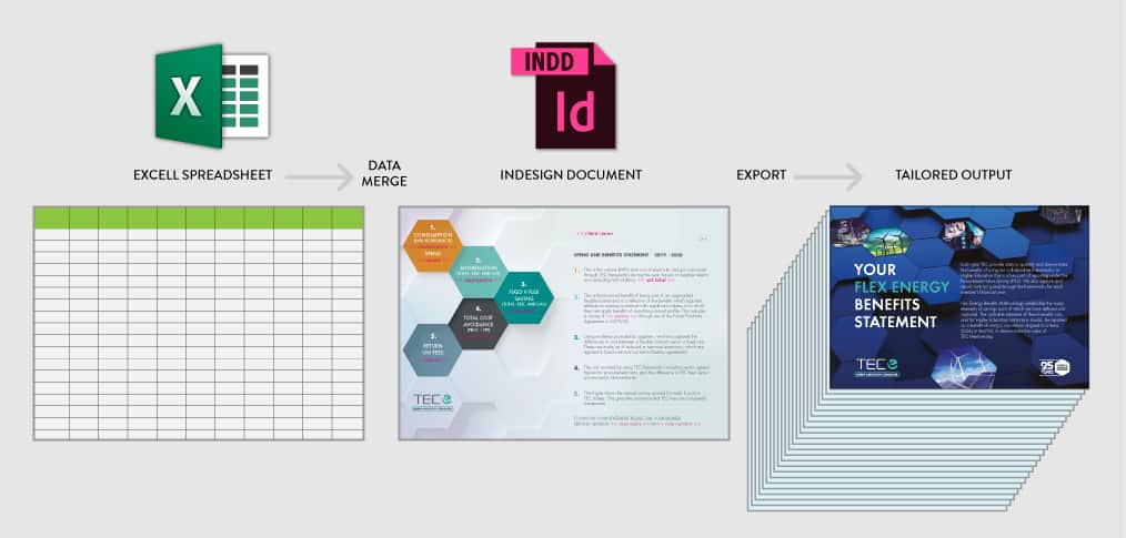
Publishing the TEC Benefits Statements to all their members last month was the first time they saw the fresh new look. Each year, we build the statements to present the yearly figures and to highlight membership benefits to each individual member. Once the template is approved, we merge the supplied data and output as pdf for distribution. It’s important to get this key communication right, so it was the perfect way to introduce this change in creative direction. Onwards and upwards.
As our designers work on the TEC Annual Report 2020, there’ll be more for members to see soon.


Leave a Comment